Blog!
Still the best name for a set of chronologically-ordered articles.
Launch it before you’re ready
Why I often urge client-collaborators to let go and open up to the magic of launching their website early. Applicable to other situations as well!
I often prompt client-collaborators to launch before they feel totally ready.
Why? Well... MAGIC!!! 🪄✨✨ That's why.
If that isn't persuasive enough, here are some more concrete reasons:
Unleash the better-but-not-yet-perfect version
As soon as what we have is better than what you have now, let’s launch it and get it working for you. Let’s let your visitors benefit from the better experience.
What makes it better? Maybe it is simply fresher and more accurate content. Maybe the look and feel of the site, well, looks and feels better despite the content being similar. Maybe there has been addition by subtraction: there is less content but the overall presentation is better.
Just because it isn’t yet 100% of what we want it to become doesn’t mean that it isn’t already going to help you and your visitors better than what it replaces. “Don’t let the perfect be the enemy of the good”… or something like that.
A different perspective
I have seen over and over how site owners’ perspectives change once the site goes from a secret development to a live working site. Now it is real, not theoretical. It is exciting and motivating! We can (and do) focus on what is actually going to make a difference instead of getting mired in details that may not matter. We can get real-world feedback from users and our gut feelings either fade or intensify. This perspective change is the main magic and is hard to imagine without experiencing it first-hand.
A website is made to be changed
A website is made to evolve to reflect who or what it represents. The advent of site-builders such as Squarespace, Wix, and Weebly make it simple and fast to publish an even better version at any time. Fix a typo or grammatical error? Done. Change the messaging? Check. Add a page? Piece of cake. Completely rearrange the site menus? Dragged-and-dropped.
It feels great to make small (and large!) changes and know that they are instantly online to anyone who visits the site. Again, it is hard to convey how different it feels to work on a live site rather than a development site.
Ready, fire, aim
There is a book called “Ready, fire, aim” that I have not read (but I know I heard the catchy title at some point, so thanks to whoever created it). The phrase is apt for launching a website. We want to do some “ready” activity to orient our efforts. Then we want to “fire” the website out there. Then we want to “aim” over time to evolve the site.
What we definitely DON'T want is to be spending a lot of time "aiming". I have seen projects with absurdly long delays because the owner refused to pull the trigger on launching a version that would have helped them and possibly accelerated positive iteration.
Minimum Viable Product (MVP)
What is the least-capable, least-developed version of the website that we can create that will help you? Let’s create and launch THAT in a minimal amount of time and get it out there for you and your visitors to benefit from. This is how a lot of product design and application development is done. The same concept can be applied to a marketing website.
Caveat: discomfort vs. pain
There is an important difference between discomfort and pain. In the case of marketing material like a website discomfort is “this isn’t good enough yet” (perfectionism) and pain is “this doesn’t feel true” (impaired authenticity). DON’T launch something that doesn’t feel true. DO launch something that is on the right path but maybe not where you want it to get to.
Put it into practice
Whether it’s a website or something else, try launching before you’re totally ready and see the magic for yourself!
How to take your own “professional” portrait
Every marketing website should have quality photographs of the people involved. Nay, not just photos... Portraits! You may not have the resources to hire a professional portraitist, so here are some tips to do it yourself.
a.k.a. Selfies for fun and profit
a.k.a. Train to be a model, or just look like one
Every marketing website should have quality photographs of the people involved. Nay, not just photos... Portraits!
You may not have the resources to hire a professional portraitist, so here are some tips to do it yourself.
Have fun
This is the first tip for so many reasons. If you dread doing this, you’ll put it off. Lighten up! If you are full of life while taking the shots that will come across to others. Professional photographers are part cheerleader and part psychologist, pumping up the model and pushing the right buttons. Do that for yourself and your portraits will shine.
Make it an event
This is not just a to-do. It’s an event. Prepare accordingly.
You have the technology in your pocket
Chances are your smart phone camera has all the resolution you need. You can’t blame the equipment.
Location, location, location
Take great care with the background of your shots. A plain wall or “field of color/pattern” often work best, if possible.
Look for elements that feel out of place or otherwise steal attention from the subject. Could be a lightswitch, door frame, exit sign… anything you don’t notice in day-to-day life but will stick out in a portrait should be avoided.
Also look for odd relationships to the subject. Maybe because of line of sight it looks like something is coming out of your head. Not good.
All that said maybe a busy background is great for you, if it has the personality you want. Wallpaper? Artwork? Nature? Shelves of stuff? You decide.
Lighting
This is a HUGE factor that is often overlooked. In general it is good to use natural lighting, but avoid direct sunlight in any part of the photo. A good trick is facing toward (or angled toward) a window with indirect light. Absolutely avoid light that is primarily coming from above (ceiling lights) or below (unless you are a mad scientist or professional monster).
Look the part
Your wardrobe, hair/grooming, etcetera make a major difference. Whatever image you’re trying to present, turn it up a little extra. Go out of your way to appropriately “dress up” for this special event. Not overdressed, just right. With a little extra.
Cropping
Leave ample space around the subject (you). We can crop in, but we can’t crop out! The eventual cropping may even tell part of the story. If you leave space we can experiment with that later. Future you will thank current you if you leave lots of space.
Who takes the photo?
Best: have a camera-person
If you can, get someone to handle the camera/phone for you. Your partner, a friend, anyone who cares about helping you get good results. Tell them what you’re going for (maybe show them these tips). You've already done the heavy lifting; they just need to be there, hold the camera, and press the button over and over and over again. Let them know you'll be taking a LOT of shots — just keep pressing/tapping that button — and how you want the shots (not) cropped. Piece of cake.
Alternative: use a “tripod” and a timer
This might be a “real” tripod or rigged from available resources like propping the camera up on a stack of books. This will let you have a nice open crop with lots of background. Be prepared for a lot of back-and-forth.
Alternative: use a webcam
Recent-model webcams take surprisingly decent quality photos. Follow the other tips and you can do well. The main issue with using a webcam is you may be limited as to where you can take the photo.
Last resort: take selfies
It is hard to take a selfie (holding the camera in your hand or on a stick) that doesn’t look like a selfie. This initiative is about raising the bar so selfies are really a last resort. That said, if you are conscious of all the other tips (ESPECIALLY the camera angle) you can make it work. Take selfies that don't look like selfies (unless a selfie is on-brand for your business).
Be a model, work that camera
A good general presentation is head and chin up, back straight, neck long, shoulders down, confident and self-assured but warm. However, if you stop there you may be missing out on pure gold.
Take a LOT of shots, experimenting with posture and expression changes. Be an actor and assume a role. Embody the traits you want to exude and see what comes across in the images. Say "Confident" or "Warm". Get creative about what those traits might be. For example, try on “Conspiratorial” and “Star-struck”.
Try some extreme emotions/personalities: scared, surprised, elated, seductive, disbelieving, comically evil, etcetera. These serve as a way to loosen up and bring out some humanity. Tell an emotive story while the camera is snapping. The “outtakes” are usually the most engaging and personable shots. Create something that feels fun to you, just for you.
And, hey, you never know. The shot you end up using may not be one you thought you were going to take when you first started.
Take “off” shots
Pros don't say "3, 2, 1..." they are constantly shooting. Often the best image is not when you thought the camera was taking the shot, but just before or just after that. If your camera has a "burst" mode or similar that will take a lot of shots in a row, try using it. Or, just repeatedly hit the shutter button. If you have a helper, ask them to take shots even "in-between" poses.
Camera angle
How does it change the feeling of the image if the camera is at the same level of your eyeline, above it, or below it (even subtly so)? Experiment!
Be prepared to do more
Take some shots and evaluate. Look at the background, lighting, posture, expression, etcetera. Make improvements and take some more. When you feel like you have enough to draw from, take another round doing something fresh. Go way out there.
You should have dozens if not 100+ shots to choose from. Pros take a ridiculous number of photos in order to get that one shot that works. You should, too.
Curation
When you start winnowing I plead with you to follow this important rule of thumb: resist throwing out any shot that makes you laugh. “But we can’t really use that, can we?” is a good sign that Yes, you should really use that. Why not? If your potential clientele is anything like you, they are going to love it! The ones you would share with friends might also be the ones you should use to market your services. I have a capitalist thought about that: “when people laugh, they feel good; when people feel good, wallets open.” Even if it is only the first part that happens, that is a win in my book. Be noteworthy.
About photos of team members
When taking photos of individual team members make sure there is some common element. It may be that the background is always the same. Or everyone is obviously wearing the same t-shirt or holding the same stuffed animal. Maybe everyone is cartoonishly frowning (an unusual thing for portraits). Whatever it is, keep your team from being a hodge-podge “team” of disparate photos. Tie them together, making sure the unifying factor is repeatable when you bring in new team members.
Why testimonials are so important, and how to ask for them
I consider testimonials to be among the absolute minimum content needs for a service-based business’s marketing website. Here is why, with tips on how to ask for and manage them yourself.
What are the absolute minimum content needs for a service-based business’s marketing website?
I suggest they are only three things:
a compelling and short introductory statement (what, for who, etcetera)
contact information
testimonials
The first two are hopefully self-explanatory. Let’s dive into why the third one (testimonials) is essential.
Testimonials can be everything a person needs to know
A well-curated set of testimonials can tell the entire story of your business.
what kind of clients you have (industries, personalities)
what you do for them (services)
how you work (relationships, project management)
the results of your work (benefits)
how you are different/better than competitors (about)
who you are as a person/company (about)
Social proof
Best of all, these details are not coming from the business owner, but from real clients. Sure, we all know that testimonials can be faked, only the favorable ones will be published, etcetera. I still maintain that testimonials have a “social proof” air about them that marketing copy can never match. I cringe a little at the term “authentic” nowadays, but it is an apt descriptor. This concept can be reinforced by using an image of each client and a link to their website or LinkedIn profile.
Testimonials are a service, not bragging
You are in a service business, and you can’t professionally help people unless you have clients. Clients need to know that you are worth hiring. Testimonials enable potential clients to hear from your past/current clients about what it is like to work with you. They are a way for people to understand how you can help them with your skills. Think of it as providing a service to these people before they are even a paying client, for free! Really, it’s an act of benevolence. Beyond food, clothing, and shelter, helping people is why you have a service-based business in the first place, right?
Editing testimonials, or not
Can a testimonial be edited? I say Yes. The obvious important thing is to preserve the writer’s message, voice, and word choices as much as practical. Yet is is just as important to make sure to deliver text that will be helpful to the viewer. In other words: it will be short enough to be approachable, clear enough to be understood, and compelling enough to inspire positive thoughts and action. Therefore I think it is okay, even preferable, to edit down and rearrange testimonial text while maintaining the writer’s hand.
Can a testimonial be embellished or ghost-written? I say No. Those feel wrong to me.
When testimonials go bad
Words matter, and some testimonials are useless or actually harmful. If a testimonial is vacuous, insipid, pandering, jargon-y, or vague then leave it out. People can say nice things without really being helpful to you or your potential clients. If you get a testimonial back that is not specific, ask for specifics. Use the “how to ask” keys below to help ensure you get good testimonials.
A few testimonial tests:
does it make you feel “aw, shucks”? (it should)
could it fit on someone else’s website, verbatim? (it shouldn’t)
does it get specific about benefits, services, relationship, etcetera (it should)
does it prop you up, by name? (it should)
does it push anyone else down, by name? (it shouldn’t)
If a testimonial fails any of those tests, edit lightly or try to get a re-write from the client if they are willing. Failing that, it might be better to omit it.
Beware celebrity status
It may be that you have a client who has name/face value to your potential clients, and it would seem that any testimonial from them would be worth sharing. Maybe it is not the person themselves, but the name value of the company they work for. I suggest that you still make sure the testimonial passes the above tests and edit/re-ask/omit appropriately.
How I ask for a (good) testimonial
Feel free to use this approach and adapt it to your style.
My keys are:
Get right with your intention: testimonials are a way to help others, and I am testimonial-worthy.
Send the testimonial request in two parts: 1) the small ask, and 2) the details.
Keep the small ask very, very short.
Keep the details very, very loose. Enough guidance to point them in the right direction. Not so much that they feel put on rails or suffocated.
In my experience many people react positively when asked for a testimonial. Most of the time they even follow-through, eventually.
Ask with confidence!
Following up, or not
After I send the details email I typically do NOT follow up to inquire “where is that testimonial you said you’d write?”. Sometimes I never end up getting a testimonial from that person, and that is okay with me. No need to force it.
Images and titles
I think that adding a portrait of each testifier is a huge boost. It puts a face to the text, makes it feel more “real”, and adds life to your website.
An easy way to do this is to look for the client’s LinkedIn profile. I typically use this image without pre-asking, because the client already “approved” it when they posted it to LinkedIn (and I ask for a secondary approval later, see below). I also will grab the client’s self-selected “job title” from LinkedIn as well. Always run the final presentation by the client!
Publish, notify, and prosper
Once I publish the testimonial on my site I send a link (so they can see it and request any edits… which no one ever has) and say thanks! It’s a nice way to close the loop, remind people you exist, and let people see themselves in a tiny bit of promotion on the interwebs.
I hope this has been helpful!
May your testimonials be plentiful, lively, and specific!
My request templates
Here are the templates I start with and adjust for the recipient and my whims of the day. Please adapt them to your own style and voice.
Remember the keys listed above!
1. The Small Ask
subject: can you help me out with a testimonial?
I’m so happy with our collaboration and would love for you to offer a brief and informal testimonial about it.
Testimonials are a BIG way you can help me help others like you.
If yes (I hope it’s a Yes!) I’ll send you some quick guidelines to make it easy for you.
Can you help me out with this?
2. The Details
subject: [reply] can you help me out with a testimonial?
Thank you for helping!
Feel free to ignore these tips and do whatever you want.
If you’re unsure about how or what to write in a testimonial here are some suggestions:
Write right now! I know you are busy, so sending this back immediately would be a to-do check-off! Seriously, just crank it out.
Don’t think too much, just write what feels true. Passion over polish. As much or as little as you want.
Use your own voice. Imagine a real conversation with words you use casually.
It’s a party. Imagine an inner-circle friend-colleague asks you: “what was it like to work with Kirk?” or “how did he help you?” or “what has been the result?” What would you say?
Make a case. Pretend you need to go back in time to convince yourself to work with me and you only have 20 seconds to do it. What would you say?
You can check out my Testimonials page for what other people did if you feel stuck: https://kirkroberts.com/testimonials
Thank you!
Rock balancing and the art of presentation
Years ago I became interested in stacking rocks, like you see in motivational posters that say “BALANCE”. An idea came to me: what if I took found "normal" rock stacks and, using the same rocks, tried to create balances that are more dramatic?
Years ago I became interested in stacking rocks (more about this below). You know, the kind of thing that you’ve seen in a million stock photos and motivational posters that say “BALANCE” and stuff like that.
I like to go on walks among trees, and especially near creeks that tumble over stones. These kinds of areas are inspirational for weekend rock balancers and you see their handiwork frequently. Usually the results are pretty plain and homogenous: flat rocks on top of each other like a stack of pancakes, obviously not natural and also obviously not in danger of toppling. There is never the thought “how is that possible?”
An idea came to me: what if I took these found stacks and, using the same rocks, tried to create balances that are more dramatic? It felt like a fun challenge, let’s do it!
Here are a couple of before and after photos from a recent walk:

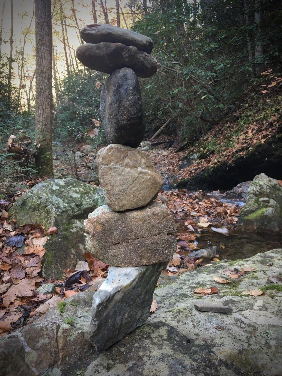


Same rocks, different configuration. (If you’re counting, one stack started with seven rocks and ended with six. I dropped one and it fell into a leaf pile and I didn’t try to find it.)
The process is as pleasing as finally getting everything to balance “right”.
It’s kind of like “what I do”
It occurred to me that the “assignment” of using given materials is like one way I collaborate with certain people: taking their “rocks” (text, images, etc) and using them to create something (a website) that is more dramatic, more pleasing, “more” than what they would have created on their own. Even without doing any editing a better presentation can be made, and the results can be both astonishing and satisfying. I enjoy the well-defined parameters and the creativity that can blossom within them. It especially feels good when I am able to make space for “rocks” that maybe are harder to work with — not as inherently pleasing, perhaps — and they become part of a larger assemblage that works.
Wanna try rock balancing?
Everything I know about doing this I learned from Peter Juhl’s short and insightful book Center of Gravity: A Guide to the Practice of Rock Balancing. One small section of the book clearly teaches the fundamentals and you may amaze yourself (and others!) with how quickly you start making noteworthy balances.
How I got started
When I lived in San Francisco (2000 – 2006) man-made rock formations appeared along the coast line, improbably balanced into columns. Years later I learned they were the work of (or inspired by) Bill Dan. At some point while walking through the Palace of Fine Arts I saw a Snapple bottle balanced on edge on a pillar base. If you click through to the Bill Dan entry in Wikipedia that I linked above you’ll see a can he balanced in just such a way. Did he balance the Snapple can I saw? I don’t know. But I was shocked, mystified, and intrigued by what I saw. It stayed with me.
Sometime in the 2010’s I started accumulating “board” games in which the goal is to stack various things. One of them (Rukshuk) even had fake rocks used to create simplified versions of real-world rock formations. Finally I realized I really wanted to stack real rocks which led me to the book I mentioned. (Kind of like how after years of hand-drumming I realized what I really wanted was to play a drum kit in a rock band, which is another story... and, hey, I guess "rock" is a thing for me, haha.)
Rock balancing is not exactly a compulsive hobby for me, but I greatly enjoy it when I do it. It is usually near running water, and the sounds combined with the focus create a meditative experience. It’s wonderful. Just writing this I find myself taking a slow deep breath and feeling more calm. If this is interesting to you, I suggest you try it yourself!
A note about destruction
Whether or not rock balances should be left standing is a sometimes passionately debated topic. Some say they are beautiful to come across unexpectedly. Some say they are unnatural and potentially dangerous. To be clear, this is NOT referring to wayfinding rock stacks/mounds used to mark trails. We are only talking about rock "art".
Often I take down my rock balances, especially if they are larger rocks. The last thing I want is some kid to find it and push on it — they always push on it — and have a big rock land on their foot or scrape their legs. Although, the more precarious balances don't last long on their own, anyway.
As for whether they should be taken down for their unnaturalness, I have issue with the premise. In terms of immersion in nature, a few rocks stacked up is less jarring to me than, say, signage about trail names and campsite locations. Furthermore, I am always on an unnatural human-made trail. The human fingerprint is with me throughout my walk whether I choose to focus on it or not.
If someone wants to knock down and strew a found rock balance I don't object to that. The structures are made to be ephemeral. I also don't object to the person who left it standing in the first place. Overall it just doesn't seem like a thing to get too worked up about either way. Live and let stack, live and let strew.
The Hourly Billing Renaissance
Maybe hourly billing isn’t the bugaboo I’ve been led to believe. In fact, maybe it’s EXACTLY what I need to have my dream professional life, and maybe it’s actually better for my clients, too.
Maybe hourly billing isn’t the bugaboo I’ve been led to believe.
In fact, maybe it’s EXACTLY what I need to have my dream professional life, and maybe it’s actually better for my clients, too.
In other words, perhaps ALL the work I do should use the Flexible Retainer model.
I’ve tried it a few times now, and am happy to report it has gone really well.
Projects get started faster. I still need to estimate, but the estimates are much more “ballpark” and presented in a range. Project agreements are simpler.
Projects tend to launch sooner. We focus on producing rapid improvements. I can switch roles fluidly as needed to help the project succeed. Flow is enhanced. It simply feels easier and more natural.
My clients trust me, and I work hard to earn that trust. The relationship feels even more like a collaborative partnership rather than vendor/buyer.
For years and years I was told (and believed) that fixed-fee was the best way to work.
Now I realize that hourly work may have much broader applications and benefits than previously thought.
The relationship between a website, an email address, and a domain
Because if you're going to buy and own a domain, website, and email you should know how they work on a high-level.
Say you enter a web address* into your browser or send an email. What happens next?
*a.k.a. a URL: Uniform Resource Locator
What is the domain?
A domain is something like yourwebsite.com
In https://www.yourwebsite.com/some-section/some-page the domain is still just yourwebsite.com
FYI — the .com part is known as a top-level domain (TLD). There are hundreds of TLDs available, such as .buzz and .clothing
FYI 2 — a subdomain is the part that comes before the domain, like in www.yourwebsite.com or news.yourwebsite.com the www and news parts are subdomains.
A domain is registered at a domain registrar.
Where does the domain point to?
The internet looks at the Domain Name Servers (DNS) of the domain to see where to send the web address request or email. It’s possible to send a web address request to one place and email to another.
Webserver / Webhosting
This is where the files that make up the web page live (which may in turn point to other webservers for more resources like images, videos, etcetera).
Email Hosting
This is where email lives and gets routed through. It’s essentially just a webserver that can handle email.
So the process looks kind of like this:
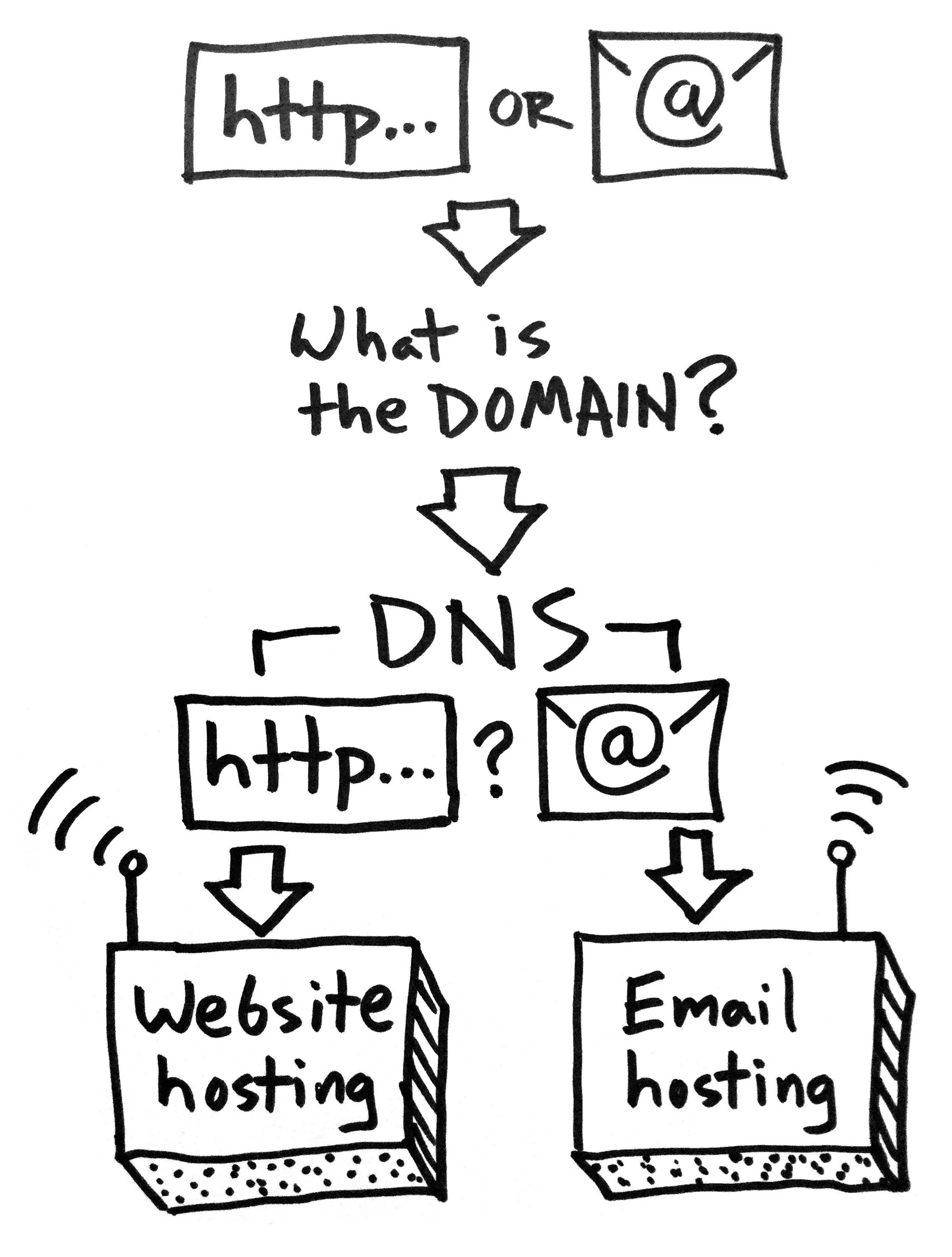

The Confusing Part
Lots of companies will handle all of this for you so people often think they are all one thing that can’t be separated. In fact your domain, website hosting, and email hosting can, and arguably should, be separated. The reasons why or why not to separate them are a whole other topic!
How I (Generally) Recommend Doing It for Your Own Website
Domain: domains are essentially a commodity, so you might as well buy them cheaply (.com domains should be about $11/year). I swear by Namecheap, which offers free email forwarding as a perk.
DNS: keep your DNS “nameservers” at your domain registrar, for flexibility’s sake.
Website hosting: many websites will be fine on “shared” webhosting, but it’s usually worthwhile to pay up for the premium shared hosting (sometimes labeled as “pro”, “turbo”, or the like). If you use a hosted site builder like Squarespace or Weebly, the hosting is part of your subscription.
Email hosting: if you can, host your email with a dedicated provider such as Google’s G Suite. This seems to avoid some of the issues that can come from using the “free” email included with your webhosting package.
I run into questions about this stuff a lot, so I hope this helps clear things up!
Padlock your website: why and how to do it
If your site is already using https:// and showing a padlock then good job, see you next time. If not, time to wrap your site up in a security blanket.
If your site is already using https:// and showing a padlock then good job, see you next time.
If not, time to wrap your site up in a security blanket.
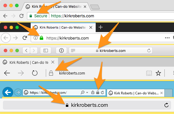
Why
The padlock indicates when a site is using the “secure protocol”, also shown by having a URL starting with https:// rather than http:// (note the “s” in the secure version).
If you don’t have this already (for encrypted transactions) the main reason you want to add it now is because of Google.
How
If you used a site builder like Squarespace or Weebly they have help docs on how to set it up if it isn’t already.
Otherwise how you enable it depends on your webhost. Some hosts (e.g. A2 Hosting) offer free continuous Let’s Encrypt security. Others, like Bluehost, make you jump through some additional hoops but may have a free option as well.
Failing a free easy option you’ll have to pay a subscription for a Secure Sockets Layer (SSL) certificate. Just a cost of living on the internet, 2018-style.
As always, if you have questions talk to your website collaborator!
Notes
Free SSL (e.g. Let’s Encrypt) should NOT be used for sensitive data entry such as credit card info, social security numbers, etc. For that a warrantied service should be used instead. Ask your webhost or web developer.
There are some complexities around third-party services such as Google Search Console and Bing Webmaster Tools, so consult with your website pro about that.
If you are ever wondering “should I enter my [password, credit card information, or other sensitive information]?” on a site you’re visiting, do NOT simply trust it because you see https:// in the address bar. That’s a good sign, but when in doubt be safe.
Essential Website Project Starter Questions
Let’s say someone asks you to build them a website (or you want to build one yourself). Here are some questions that can help you figure out what they (or you) really want and need.
Let’s say someone asks you to build them a website (or you want to build one yourself).
Here are some questions that can help you figure out what they (or you) really want and need.
(I like to say: “A website can range in complexity from one line of code all the way up to Amazon or Facebook. Let’s figure out what we’re really talking about here.”)
The Questions
- What are your goals for your website? (e.g. how does it help YOU?)
- What can people DO when they visit the website? Please provide links to similar examples online if you have them.
- What content and graphic resources do you have available right now, and can you realistically produce yourself? (logo, color palette, photos, text, video, audio, etcetera)
- Who will update the website, what will they update, and how often?
- What financial resources do you have available for the project, for initial setup and ongoing fees and maintenance? (I need to know what level of solutions I can propose)
- Are there any scheduling issues to plan around? (“must launch by…”, “I’m unavailable for collaboration during…”, etcetera)
- What other needs or wants do you have for this project? (please indicate "needs" vs. "wants”… this can be tricky)
This seems to help people get into the right mindset, past the hopelessly vague “I need a website!”
It also provides a bridge to talk about money that is much better than the reasonable but usually misconstrued request of “what’s your budget?”
There’s more to talk about with the money question, but I’ll leave that to a future message.
How to easily create “in-device” screenshots
It just takes a few smart clicks to create ready-to-use images of any website in a range of popular mobile device "frames."
Here’s an easy way to get a screenshot of a website so it looks like it’s in a mobile device.
Perfect for creating your portfolio images, or updating your old images to use more modern device frames.
Note: all images are linked to larger versions so you can more easily see details.
Download Chrome for Desktop or update Chrome
You may already have the Chrome browser installed. If not, download Chrome for free.
On a Mac you can check Chrome > About Google Chrome to make sure you have the most recent version (set up auto updates if not already enabled!).
Open Chrome & the page you want to display
Just like you’re surfing the web. Now we’re going to dive in behind-the-scenes.
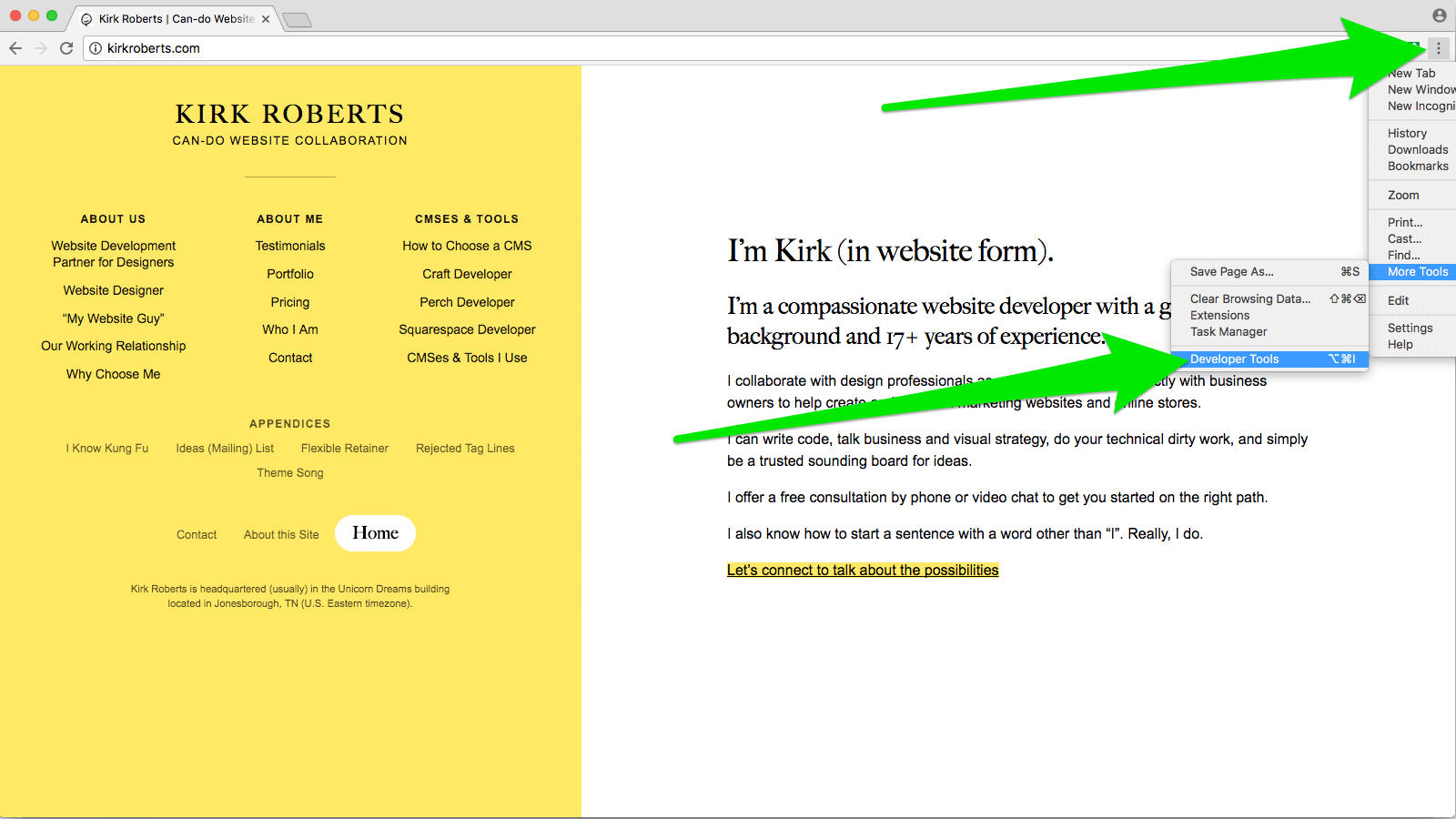
Enable Developer Tools
In Chrome, find the “three dots” menu at the top right of the browser window and choose More Tools > Developer Tools. Click that, opening the Developer Tools panel (may be a sidebar, at the bottom of the window, or a separate window entirely). Or, on a Mac press command-shift-I (capital I as in Ice Ice Baby) to open the panel.
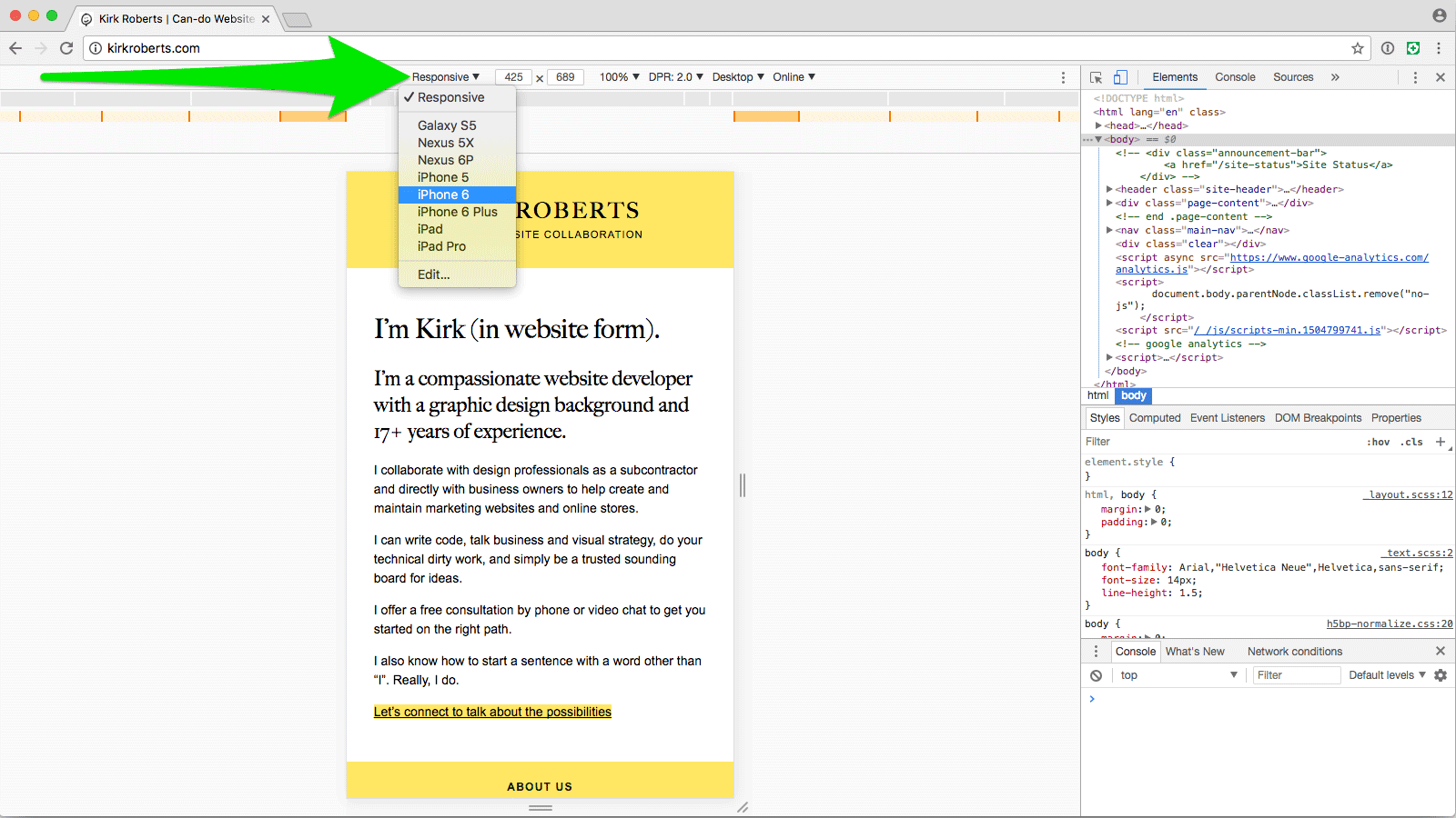
Go into Responsive mode
At the top of the Developer Tools panel find the icon that looks like a phone and a tablet. Click that, which constricts the viewport and adds the “device toolbar” above the current webpage. Or, on a Mac press command-shift-M to show the device toolbar.
Choose the device you want
Find the “Responsive” menu at the top of the new interactive bar and choose the device you want to emulate.
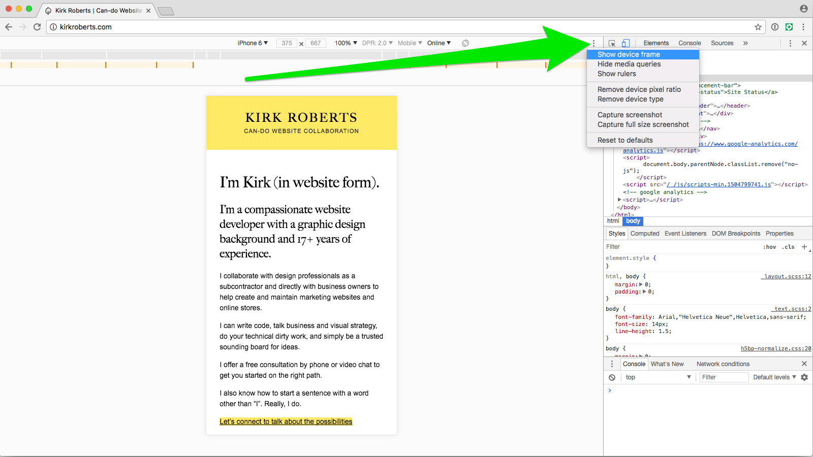
Choose to show device frame
If the resulting viewport doesn’t already have the device frame around it find the “three dots” menu at the top-right of the device toolbar and select “Show device frame”.
Rotate the device, if wanted
You can rotate the device by finding and clicking the rotate icon in the device toolbar.
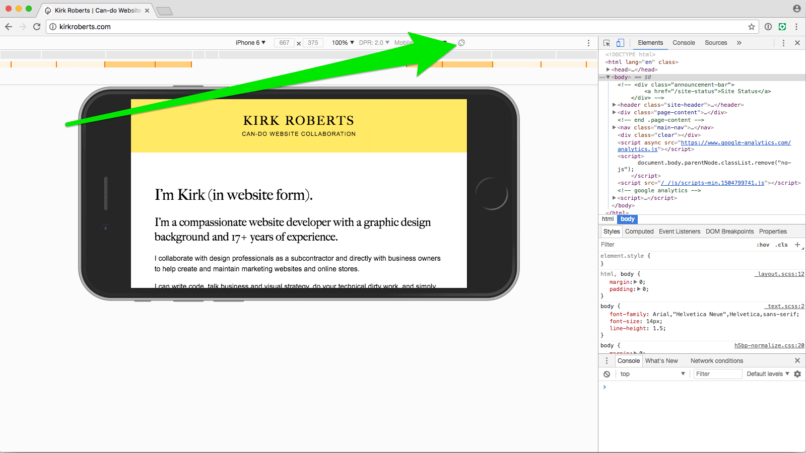
Choose Capture Screenshot
(It's okay if the device frame is cropped by your browser window. The resulting image will still be complete.) From the same “three dots” menu choose “Capture screenshot”. This will download a PNG image to your downloads folder (wherever that might be). You can also access the download from the toolbar that appears at the bottom of the Chrome window or on a Mac from Window > Downloads.
Now with just a few clicks you have a PNG image of the webpage inside of the device you selected, ready to place into your portfolio image layout PSD.
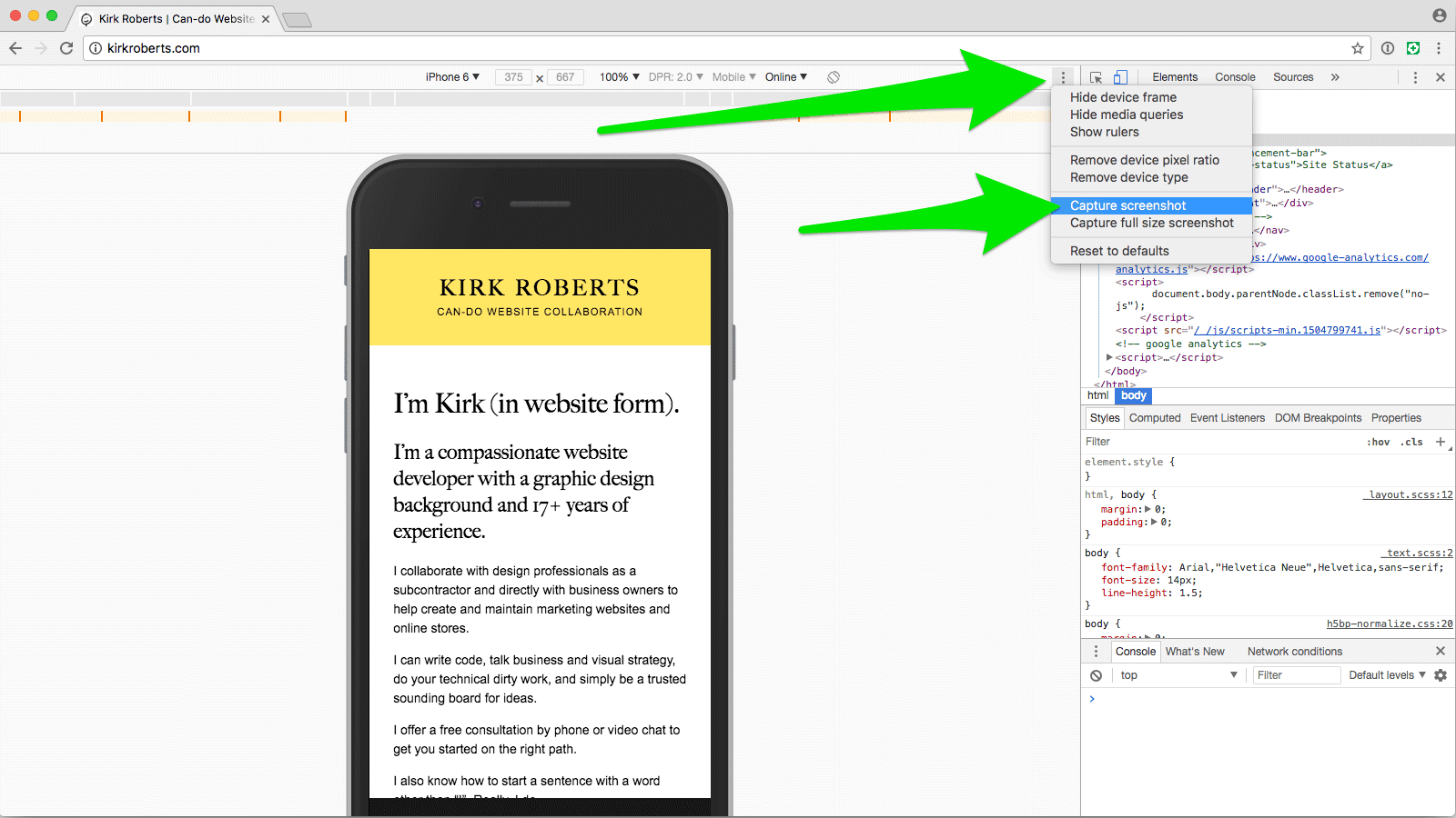
Design comps in a device
If you want to show design comps rather than a live site, use this technique to get a device frame PNG and then mask in your website artwork.
Hope that is helpful!
Web process: Rapid Launch and Iteration
Website projects of many different shapes and sizes can often benefit greatly from a “ready, fire, aim” approach of rapid launch and iteration rather than a traditional print-based process.
The Take-away
Website projects of many different shapes and sizes can often benefit greatly from a “ready, fire, aim” approach of rapid launch and iteration rather than a traditional print-based process.
Websites are Alive
A website works best when it has fresh relevant content and is constantly evolving to the changing needs of its owners and visitors. In other words: a website should never be “done.” Ever.
Does that ring true?
If so… why do we spend so much time trying to “get it right” before we launch a website?
The Web Mindset
Let’s get in the web mindset: perpetual evolution through iterative improvements. And if we’re going to adopt that path then we can start anywhere and move forward.
If a company has no website, they should have a website as soon as possible with bare-bones “who, what, where” and contact information. The detailed “why and how” can come later. The customized look and feel can come later. The additional functionality can come later. And it can all be adjusted while live for the world to find and see.
If a company has a website that is a liability (visually, technologically, functionally, etc) it may be best to immediately replace it with a clean modern bare-bones site that functions well on mobile devices. Then iterate.
If a company has an okay site but wants a re-design, let’s ask these questions: Does the site really need to be overhauled? What are the real issues and how can they be addressed incrementally? Are the needs based around content, architecture, functionality, data structure, or something else? How can the project be broken down so we can get improvements out into the real world faster and address the most important issues first?
Not “Coming Soon”
To be clear, I’m not talking about launching a “coming soon” page while the big web project takes months and months (and months) to complete. I’m talking about “this is your website — maybe it is currently only one page — now what is the next thing we need to do to it to make it better?” Then building out from there, continuously publishing improvements and additions. Get it out there. Your site is already here.
This way the website owner gets a functional website much MUCH faster and then revisions can be based entirely on real-world needs and feedback. It’s empowering and exciting and motivating. It creates momentum.
Critically, this also helps the website owner get into the right mindset: “my website is meant to be changed and added to, little by little, over and over again.” It isn’t something to build, forget about, and then completely uproot every 3 - 5 years.
This approach is made much easier by using a modern online site builder. In capable hands a website can be built out and changed extremely quickly. There’s no need to speculate on what might work when you can build something immediately and put it out into the world right away, then iterate periodically.
But it also can be adapted to work on custom designs with modular front-end code and a modern content management system that uses structured data. There are many sites and site owners that really need a specialized visual design and functionality, custom input forms for their data, and advanced scripting and logic. If anything those demands make it all the more important to take a flexible approach that can adapt over time.
It all starts with having the right approach, right from the start.
Notes:
- Ironically I rewrote and reframed this post many times and sat on it for quite a while.
- In writing this I came across a business book called “Ready, Fire, Aim”. Haven’t read it, but I bet the ideas are pretty similar.
- I keep thinking about Anne Lamott’s book on writing, “Bird by Bird”, in which she encourages “shitty first drafts”. Pardon the language.
- The software development book “Getting Real” by 37 Signals is a major influence on this idea. All websites, even brochure sites, can be thought of as apps: they serve a purpose and provide functionality (however basic).
Website design mindset: art directing responsive images
Sometimes it's useful to show different images (or image crops) on different screen sizes and shapes. Here’s a quick introduction to the idea.
As a person interested in website design you’re probably familiar with the concept of responsive images. As the website gets narrower the images eventually get smaller along with it so they stay in full view.
You may not know that it’s possible to “art direct” the images depending on the screen size and device orientation. “Art direct” is a fancy way of saying that we’ll show a different image based on some rules, and the different images can vary in size, proportions, and content.
Example time
Let’s say you have this desktop view (putting aside that in this age we should always work mobile-first):
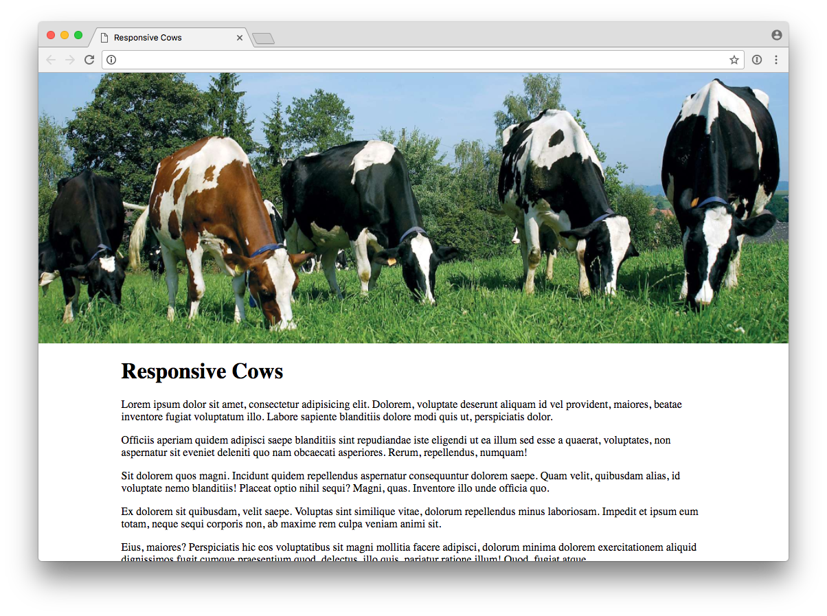
The “banner” image is nice and wide. Now we look at the same site on a phone.
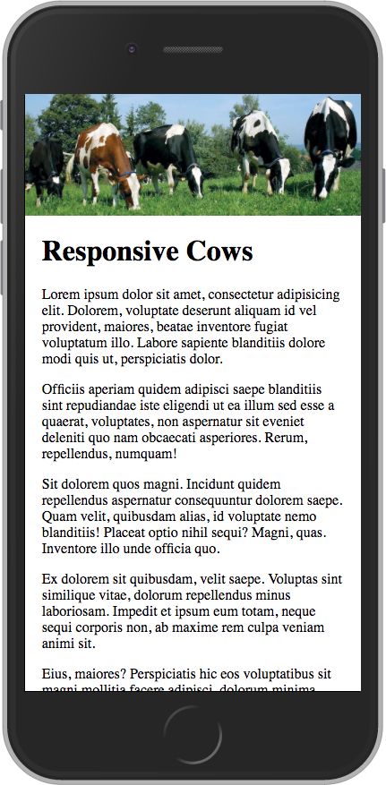
The image is constrained to fit the width of the device. It’s perfectly acceptable, but maybe we can do better by smartly using a different image proportion and/or crop when the screen is narrower, while keeping the desktop view the same as we already saw. We have the elves change the images for us.
Let’s look at a few of the many possibilities.
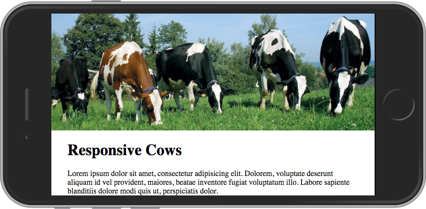
This second phone image changes the proportion to show more of the top and bottom and fill a bit more of the view. This might be more of the image/text balance that we want to see when the page first loads. Those cows are looking pretty tiny and hard to make out, though.

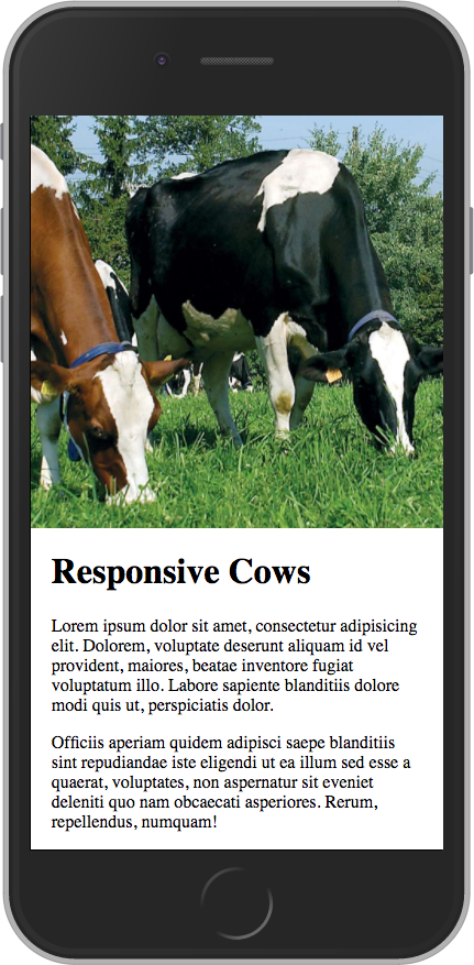
This third phone image shows another proportion for the image and is cropped in to show detail. We get a nice big image and it’s still clear that the page scrolls with more text. Great cow view.
And then maybe when a device is in landscape orientation we want to show the “banner” crop again so a portion of the text can be visible on page load.
The Takeaway
What images are shown in different screen sizes and orientations is yours to make — that’s why it’s called art directing.
While it can be easy to go overboard with micro-managing, some smart general rules can make a website’s images much better suited for viewing on a wide range of screen sizes.
The possibility of art directing images is definitely something to keep in mind when you’re designing your next website.
Website Creation Process: Atomic Design
Do you like saving time and money? Then this process is for you.
Do you like saving time and money? Yes or no?
Everyone who works on custom website projects should read Brad Frost’s book Atomic Design. You can read it for free online! And it’s short! With pictures!
TL;DR (too long, didn’t read)
If you’re strapped for time, I suggest starting with chapter 4, Atomic Workflow. (And when you want to read the rest, feel free to skip the coder-y chapter 3!)
Still TL;DR
Okay, I get it, ain’t got time: just read the sections in Chapter 4 about redefining design for the web, and death to the waterfall/linear process. (But I personally wouldn’t want to miss the part using an analogy about organizing Legos and how it relates to web process.)
The Gist
Using design systems promote consistency and cohesion, speed up your team’s productivity, establish a more collaborative workflow, establish a shared vocabulary, provide helpful documentation, make testing easier, and serve as a future-friendly foundation. The “atomic design” system consists of atoms, molecules, organisms, templates, and pages. The book goes into not-overwhelming detail about what atomic design is, how to get client buy-in, a workflow process, and how it helps after the site is launched.
Two tidbits that caught me by surprise (both in Chapter 4)
- a compelling case for creating initial content and display patterns with… a spreadsheet
- the assertion that “If developers aren’t coding from day one of the project, there’s something wrong with the process.”
There are LOTS of good tidbits in there nestled in among the big ideas that could be a real game-changer if something doesn't feel quite right with your website projects.
Read it with an open mind and let your gears start turning…
Use icon fonts in your next design!
Icon fonts have many advantages over pixel-based images. Here are some reasons and resources to incorporate them in your next design project.
The benefits are numerous. Time to start a new habit.
[editor’s note, 2018: times change, and SVG graphics are widely considered to be superior to icon fonts now]
Icon fonts are great for social network links and common interface elements like arrows. Here’s why:
- Resolution-independence: icon fonts look crisp on high-resolution screens and scale easily for animation or design-indecision
- Icon fonts can improve site loading speeds as opposed to using images for icons
- Ready-made design: why reinvent the wheel for common icons?
- Expansive (and expanding) libraries. Suddenly need an additional icon? No problem, it’s probably already there for you.
You can simply go with the venerable Font Awesome or mix-n-match different icon font libraries with Fontello (click the little house icon next to each font name to visit the font’s website).
Most, if not all, of the fonts have desktop font counterparts so you can use them in Photoshop or your comping tool of choice.
Embrace the screen medium and save time. Use icon fonts!
Auto-Forwarding Carousels and Accordions Annoy Users and Reduce Visibility
If you have a website — and especially if you design websites for others — it’s worth paying attention to the Nielson Norman Group’s opinions on website usability. Spoiler: they think auto-advancing carousels are bad (meaning not good).
If you have a website — and especially if you design websites for others — it’s worth paying attention to the Nielson Norman Group’s opinions on website usability.
Many site owners and designers don’t bother with user testing and instead rely on trends, personal preferences, advice from the vocal minority, etcetera. That may be fine, but it certainly can be illuminating to read the findings of a company that is squarely focused on how websites meet goals rather than their aesthetics. The point of a website is to do a job, yes?
In a 2013 article Jakob Nielson slays a couple of sacred cows of website design: auto-advancing messaging carousels (a.k.a. “sliders”) and banner-style links to internal content.
The main points are:
- auto-advancing sliders hide content and frustrate users
- sliders should only be advanced by user-control
- banner-style links that look like ads are often ignored
If tempted to use an auto-moving slider you might instead consider what content should really be prioritized and shown first, with all other content hidden until requested.
Just a few more things to consider when trying to make your website(s) more user-friendly.
Easing into a Responsive Design Workflow
You’ve probably heard about Responsive Design*, but maybe you don’t know how to start designing for it, or maybe it seems like too much work. Here is a baby-step that will get you going in the right direction.
You’ve probably heard about Responsive Design*, but maybe you don’t know how to start designing for it, or maybe it seems like too much work.
I recently came across this very interesting article titled “Design Process In The Responsive Age” (which is actually almost a year old) and believe this is a great “baby step” toward a full responsive design workflow with a dash of Mobile First smarts.
The basics are these
- before you visually design anything create a wireframe for the phone-sized view (might just be a napkin sketch!)
- use that wireframe to help design your normal desktop-sized view like you normally do
- deliver both to your developer and have them work with you to fill in the gaps
This works for websites you’ve already designed, too. Just create the phone-sized wireframe retroactively.
It’s such a simple (and quick!) addition to your process, but it will get you thinking about how content reshuffles and gets prioritized in a limited viewport.
I highly recommend you read the article and talk with your developer about this approach. (If you ARE your own developer, have a talk with yourself... just make sure no one else is listening.)
* technically speaking Responsive Design refers to using fluid grids, flexible images, and media queries to provide an optimized website layout for variable screen sizes/resolutions.
Responsive Design: Stop Designing Print for the Web
Are you still designing websites like they’re static print pieces? It could be so much better...
You know the print design drill cold: do sketches, show the client mockups, refine, refine, refine, get approval, send it to production. It worked for print, and it worked for the web (for a while). However, with the advent of Responsive Design and the ever-evolving range of screen sizes we need to overhaul the process of creating a website.
Here are a couple of tools to help change your process for the better and overlap design and development in new, exciting — and more efficient and successful — ways.
Style Tiles
The style tile concept goes one step further than mood boards but stops short of a full (fixed-width) design comp. You get the look/feel without sweating the nitty-gritty details of page layouts. Big time-saver! The styles can even be applied to code modules that can be tested in various sized browsers. Check out the Style Tiles site with a downloadable Photoshop template and workflow tips.
Responsive Interactive Wireframing
Rapid prototyping provides a springboard on the full development of the website. The Foundation framework will help you (or your favorite code nerd) create interactive wireframes with responsive layouts so you can iterate layout and functionality before investing tons of time in creating Photoshop mockups. How often have you finished a site only to realize the “working” version didn’t meet expectations? This step goes a long way to isolating those issues when it’s far less expensive to fix them.
By combining the two ideas that these tools provide you’ll be well on your way to building a better process for creating a website that works well and looks good across a variety of devices.
See you in the future!
How To Use Your Site (Video Edition)
To help clients handle their CMS like a pro I create custom video tutorials (screencasts) showing how to accomplish common and specialized tasks.
More and more the sites I create are integrated with a content management system (CMS). I have a few favorite CMSs, and I believe they are all easy for the average site owner to use.
But with any system there is at least some learning curve, especially when the content management capabilities become more complex. To help clients handle their CMS like a pro I create custom video tutorials (screencasts) showing how to accomplish common and specialized tasks. Did you catch that these videos are CUSTOM?
Benefits of custom video tutorials
- Site owners and editors can see “how to” on their own site.
- The tutorials can be watched whenever they want, however many times they want.
- To hand-off site-editing responsibilities, they can simply point the new person to the tutorials which are hosted in a secret location on their own website.
Very handy!
Clients love these tutorials, and they have become a standard part of my development/training process for sites I build with a CMS. Because the videos are not branded they are equally suitable when I’m developing the site in a sub-contracting arrangement.
Note: you are welcome to bring in your own snacks (mmmm... Twizzlers... my brain says they’re just strawberry-flavored plastic, but my mouth says “soooo goooooooood”).